
About Me

Games

Web

Gallery

Work

Music

Contact
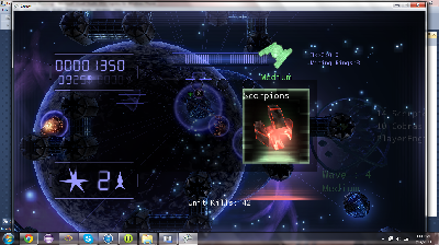
This is a screen shot from the second game I created with the XNA game framework. It seems a little on the colorful side to me but I like the background. It was a multiplayer head to head tower defense game. |
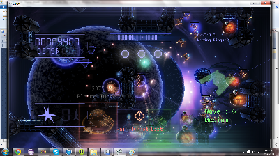
This is a screen shot from the second game I created with the XNA game framework. I think the problem with this game was that there was always too much going on at once. It confused anyone who playtested it. I enjoyed it though. |
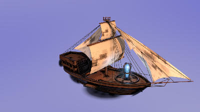
Concept art I did for a streampunk game idea. I never got very far beyond the concept and a few art pieces. It was inspired by the ending battle sequence of Bioshock Infinate. Great game. |
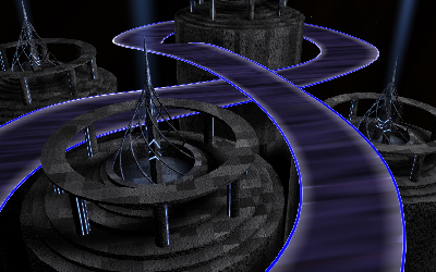
Old concept art for a racing game. The idea was to do something like audiosurf but somehow not as linear. This idea never made it past the art stage but I had fun exploring light baking. |
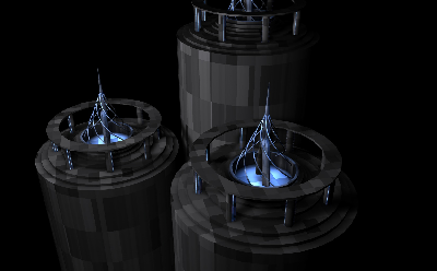
Looking back at this I really like the use of light. The shadows are present but not defined or harsh. Maybe a little heavy on the ambient occlusion. |
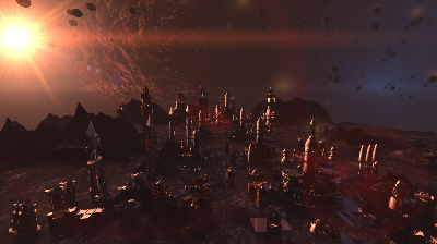
This was modeled by a classmate but I did the texturing, the background, and the lignting. I like the colors and the models. |

Depth of field cloud rendering. I was originally going to use this for my LinkedIn profile but it didn't work. You can see the one I used on My LinkedIn |
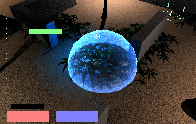
This was probably the first game I wrote using the XNA framework. This was the shield ability. I had way too much fun with shaders. The shield was a combination of a texture, a fresnel, and a fade out as the shield reached the ground. |
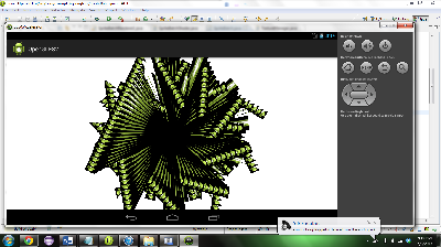
A lovely bug on the Android simulator. The bug is with my code, not the simulator. A first attempt to get spritebatching working on Android. This bug is one corner of every rectangle is centered at (0, 0). |
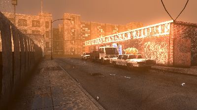
One of my favorite art pieces. I based it on a photograph that I found online. The original photo wasn't so orange. I used a combination of volumetric lights combined with layered transparent cylinders with additive blending to create the fog. |
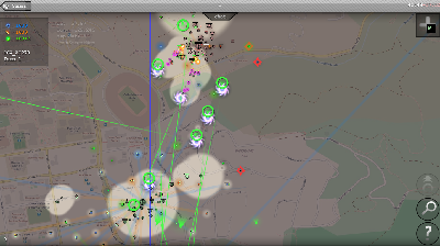
Project StreetWars placeholder graphics: This is the first screenshot I took which shows the game with its new line of sight graphics. The map is transparent with a black background behind it and white circles drawn over it. I managed to dodge having to use texture bufferring :) |
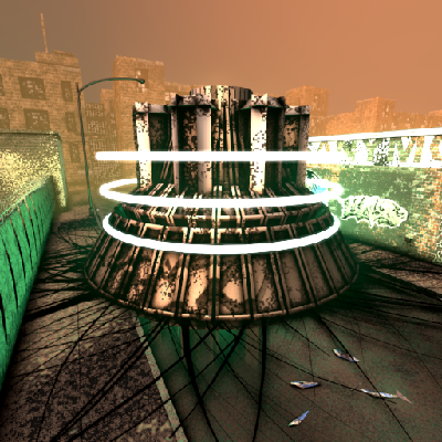
A close up and personal render with the cyborg base placed in my city block scene. |
thumb.png)
I really like DCAM Synth Squad. Its a really wonderful pack of soft synths which I use on just about every track I make. I really like how the keys look in this picture. |
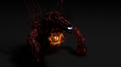
This guy was originally going to show up in Project Streetwars. Sadly for him, he didn't make the cut but he still looks pretty darn cool. I had never really done modeling of anything biological before so this was a bit of a stretch for me. I spent about three hours just modelling the heart. |
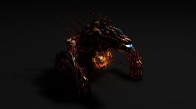
A newer version. This one got some more varied texturing and a couple of extra spikes. |
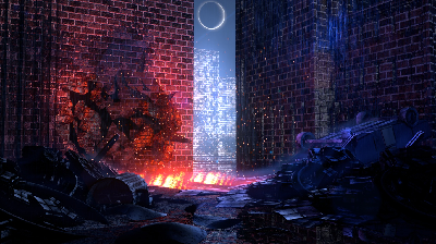
Someone did a concept art for the Dresden Files which I really liked and wanted to re-create using Cinema4D. I didn't get past modeling the scene but I really like how the rain turned out. Its a bit colorful for my taste. No matter how many times I look at this scene, the colors still look off to me. |
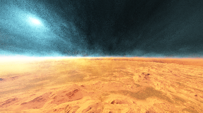
I forget the name of the program I did this in but it wasn't one of my usual ones. It was some sort of planet simulator. I placed the camera right inside the atmosphere layer. |
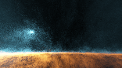
Another shot from the same program. Space, the final fronteer... |
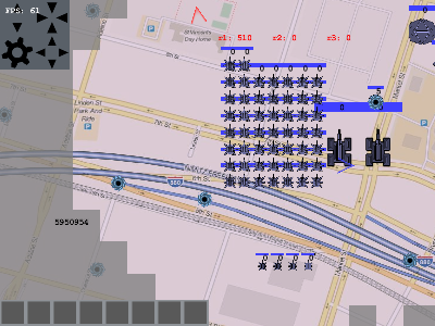
The way my latest game Project StreetWars started out. This is how ugly placeholder graphics can get. |
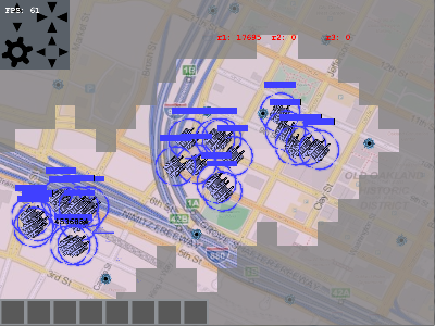
Project StreetWars placeholder graphics: A new unit type. These are rocket launching base wreckers. If you want to wreck someone's base, buy these. |
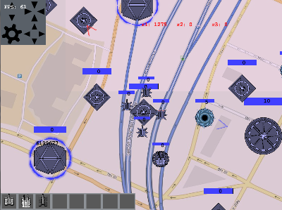
Project StreetWars placeholder graphics: Look at those ugly healthbars (that's what the blue bars are). Just in case you were wondering, those are buttons in the upper left. |
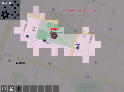
Project StreetWars placeholder graphics: The original placeholder line of sight. It doesn't use any sort of clever drawing tricks. It looks like ugly blocks because it is ugly blocks. |
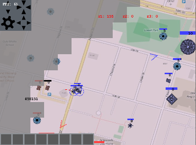
Project StreetWars placeholder graphics: That's me attacking my friend during playtesting. Basic attacking units vs scouting units. |
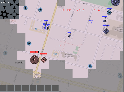
Project StreetWars placeholder graphics: I'm attacking his base now. It won't last long becuase he doesn't have any defenders. This was still the game at it's most basic. Hardly any unit variance. More to come soon... |
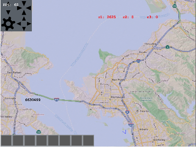
Project StreetWars placeholder graphics: A shot of the San Fransisco Bay Area. I'm are still using tile-based maps. They look very flat to me now. |
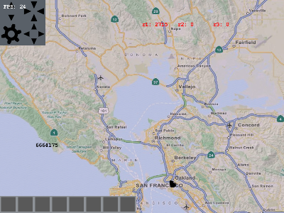
Project StreetWars placeholder graphics: More Bay Area... |
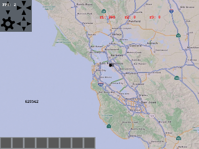
Project StreetWars placeholder graphics: More... |
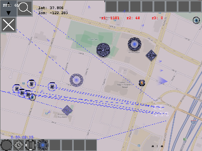
Project StreetWars placeholder graphics: Now the game starts to look a little better. It has drop shadows under units. The healthbars get outlines. The arrows look nicer. |
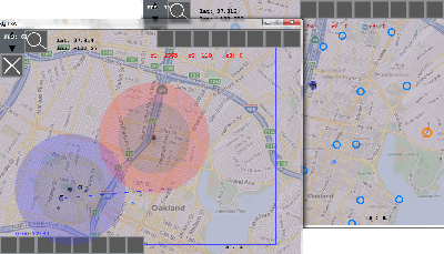
Project StreetWars placeholder graphics: Teleporters! Send units from one place to another. You can't send them too close to your opponent's base. That's what the rings show. |
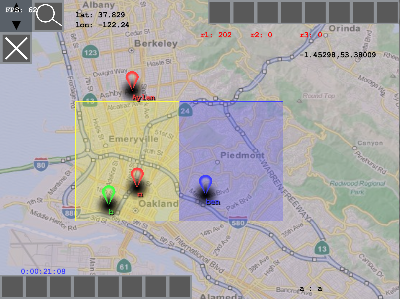
Project StreetWars placeholder graphics: The arrows show where people's bases are. You can zoom out and see all the players nearby. |
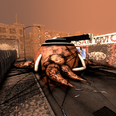
A close up and personal shot with the harvester home base also placed in my city block scene. I think these guys ended up being my favorite race. |

Hinder is a rock band that I like. I also liked this logo and wanted to do a wallpaper based on it. |
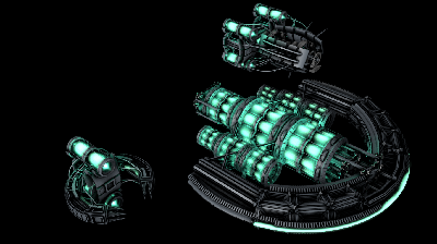
All three Cyborg air units rendered in the same place. I like the middle size one. It gets my favorite ability. |
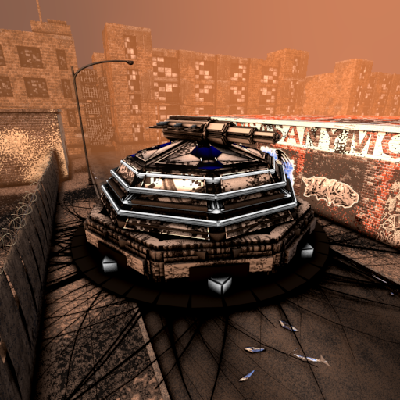
A close up render of the human base. This was the first race to be completed and it got the most playtesting. In my opinion, it has the coolest turrets. |

|
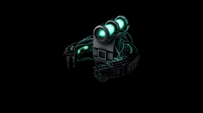
This guy did make it into Project Streetwars. He gets built by another larger aircraft and then slowly dies over time. Has some impressive range and is great for wrecking bases. The trick is to build lots. |
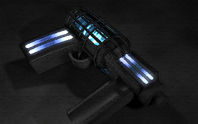
Old futuristic gun art I did. The paint style effect was done with Photoshop. This I did a while ago and the shapes look pretty basic to me but I like the texturing. |

LearnBot (temp title) is an idea I've been playing with for a while for an adaptive learning AI which would help kids learn new subjects. Sort of a more dynamic Kahn Academy. I don't know if I will make it but it has been a tug in the back of my head for a while. The art was fun to do. This is a billboard render of all the characters. |

iOS launching screen for Project StreetWars |

A card I made for my mom on mother's day. Feel free to use it. |
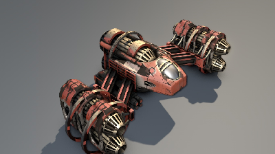
This I did for a Cinema4D class where the teacher asked us all the make space ships. I did probably about 10 different paint textures for this one. This was when I first started experimenting with layering ambient occlusion into transparency layers for textures. Thats how I got it to look like much of the paint had been worn off. |
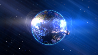
This made it into PSW. See if you can spot where. |
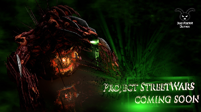
A concept poster for project streetwars featuring the friendly neighborhood FaceShredder. Originally I was going to release PSW under the name "Bad Rabbit Games" but I decided just to release it under my own name instead. |
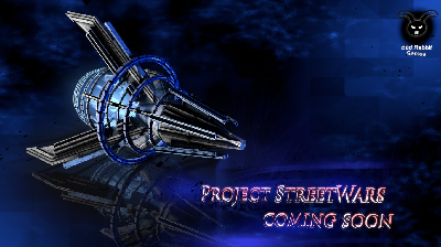
I like this ship but the shapes are a little basic and the textures look kind of flat to me. This ship did not make it into the final PSW unit set. |
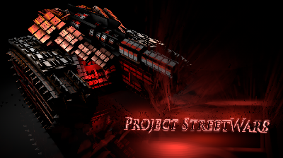
Another shot of the PSW tank. |

Another shot of the PSW tank. |
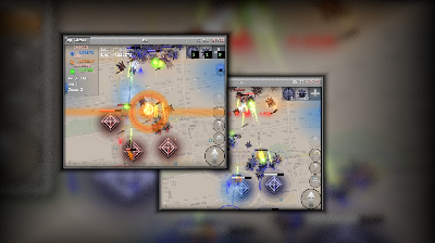
Stylized Project StreetWars game screenshots. The old maps look funny to me now. |
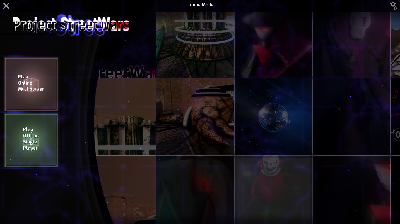
Project StreetWars menu screenshot taken from the desktop version. |
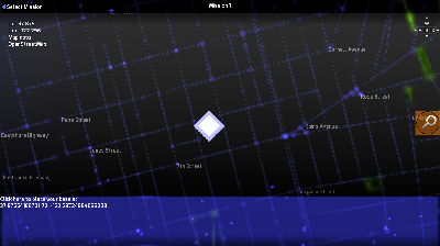
The most recent version of the PSW map. It uses vector data and is rendered as part of the spritebatched world rather than frozen tile images. Screenshot taken from the desktop version. |
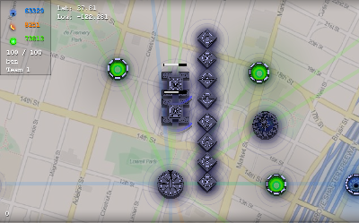
Project StreetWars placeholder graphics: The UI actually looks like UI! These are buildings which produce units and resources. |
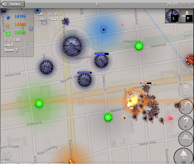
Project StreetWars placeholder graphics: These blue buildings are turrets. I don't remember how this ended but it looks good... |
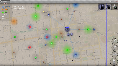
Project StreetWars placeholder graphics: You can see the buttons on right. The camera button got cut but the rest stayed. The big arrow button is mobile only. The magnifying glass allows the user to jump to new locations. The ? button allows the user to view unit stats. The arrow is like right click for mobile. The top button upgrades all your production structures so you don't have to do it manually. |
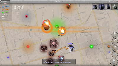
Project StreetWars placeholder graphics: Boom! The blue guys I'm driving are skimmers. Light armor good for taking down infantry. That enemy attacking unit is a lightning turret. Good fort aking down armor. This doesn't end well for me. |
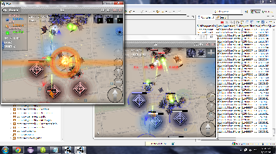
Project StreetWars placeholder graphics: Here you can see me testing two clients on the same game. The game is looking even better. Units have gotten more unique bullet effects and explosions look cooler. |
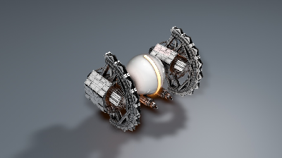
I just made this for fun. It's not for any game. |

LearnBot (temp title) is an idea I've been playing with for a while for an adaptive learning AI which would help kids learn new subjects. Sort of a more dynamic Kahn Academy. I don't know if I will make it but it has been a tug in the back of my head for a while. The art was fun to do. This is a full color render of all the characters. |

Very old Cinema4D art I did. I liked the use of fresnel (which is probably my favorite shader effect alongside ambient occlusion) |
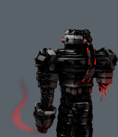
A robot. Just because. |
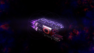
Another unit I was thinking about adding to PSW. Didn't make the cut. I like the background but the colors on the ship seem off to me. |
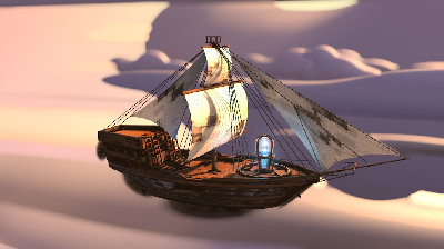
The steampunk game ship with an added cloud background. Those clouds are just Metaballs blurred out of focus with depth of field. Don't tell anyone that. |
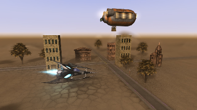
An old shot from my Cinema4D class which a classmate asked me to texture. Its amazing how much depth of field can add to a scene. |
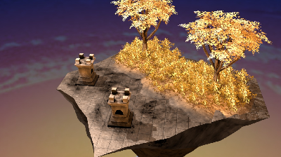
I made this when I made a deferred renderer using XNA a while ago. This is rendered using Cinema4D but I got this look better actually using my deferred renderer. I didn't get the shadows working though but it still looked great in real time. I used a better background for the real-time version. Whats deferred rendering? |
Another card I made for my mom for her birthday. Feel free to use it if you want. |
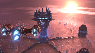
My scene that I created for the Cinema4D class. The fog on the ground is created by layered transparent additive planes which receive shadows. Took forever to render but totally worth it. |
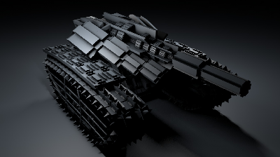
A black and white untextured version of the PSW tank. |

LearnBot (temp title) is an idea I've been playing with for a while for an adaptive learning AI which would help kids learn new subjects. Sort of a more dynamic Kahn Academy. I don't know if I will make it but it has been a tug in the back of my head for a while. |

Old art I did for fun. I like the glass but everything looks very digital and lifeless to me. I like the textures though. |
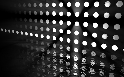
A very old piece of art I did. I really like volumetric lights. |

LearnBot (temp title) is an idea I've been playing with for a while for an adaptive learning AI which would help kids learn new subjects. Sort of a more dynamic Kahn Academy. I don't know if I will make it but it has been a tug in the back of my head for a while. |
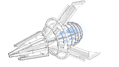
I like this rendering style. |
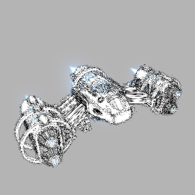
A massive wireframe rendering of the ship I made in my Cinema4D class. This took 5 hours to render on my laptop. |
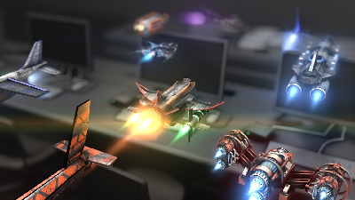
The scene created by the entire Cinema4d class. I was asked to texture all the ships and this is a render of all of all of them together. The scene in the background is our classroom. Thats right. For out Cinema4D class, we modelled our classroom. Thats either great creativity or none at all. I can't decide. |